That, however, is not the way I really think. Sure, I can rationalize things that way, but it's not the way I store, recall, organize information inside my head. It's not the way I see the decision space.
In the end, software design is about things going together and things staying apart, at all the granularity levels (see also my post on partitioning).
As I progress in my understanding of forces, I tend to form clusters. Clusters are born out of attraction and rejection inside the decision space. I've found that thinking this way helps me reach a better understanding of my design instinct, and to communicate my thoughts more clearly.
Now, although I've been thinking about this for long while (not full-time, lucky me :-), I can't say I have found the perfect representation. The decision space in inherently multi-dimensional, and I always end up needing more dimensions that I can fit either in 2D or 3D. Over time, I tried several notations, inventing things from scratch or borrowing from other domains. Most were dead ends. In the end, I've chosen (so far :-) a very simple representation, based on just 3 concepts (possibly 4 or 5).
- nodes
Nodes represent information, which is our material. Information has fractal nature, and I don't bother if I'm mixing up levels. Therefore, a node may represent a business goal, or the adoption of a tool or library, or a nonfunctional requirement, or a specific component, class, function. While most methods are based on a strict separation of concepts, I find that very limiting.
- an attraction relationship
Nodes can attract each other. For instance, a node labeled "reliable" may attract a node labeled "redundant" when reasoning about the large display problem. I just connect the two nodes using a thick line with little "hands" on the ends. I place attracted nodes close to each other.
- a rejection relationship
Nodes can reject each other. For instance, stateful most clearly reject stateless :-). Some technology might be at odd with another. A subsystem must not depend on another. And so on. Nodes that reject each other are placed at some distance.
It's all very simple and unsophisticated. Here is an example based on the large display problem, inspired by the discussion on design rationale:

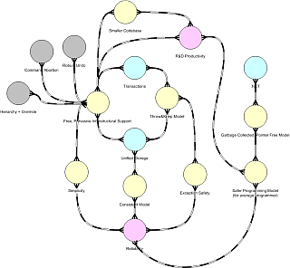
and here are two diagrams I've used in real-world projects recently, scaled down to protect the innocent:

The relationship between a node, a cluster, and an Alexandrian center is better left for another time. Still, a node in one diagram may represent an entire cluster, or an entire diagram. Right now I'm tempted to use a slightly different symbol (which would be the fourth) to represent "expandable" nodes, although I'm really trying to keep symbols to a bare minimum. I'm also using colors, but so far in a very informal way.
As simple as it is, I've found this diagram to be very effective as a reasoning device, while too many diagrams end up being mere documentation devices. I can sit in front of my (large :-) screen, think and draw, and the drawing helps me focus. I can draw this on a whiteboard in a meeting, and everyone get up to speed very quickly on what I'm doing.
This, however, is just half the story. We can surely work with informal concepts and diagrams, and that's fine, but what I'm trying to do is to add precision to the diagram. Precision is often confused with details, like "a class diagram is more precise if you show all the parameters and types". I'm not looking for that kind of "precision". Actually, I don't want this diagram to be redundant with code at all; we already have many code-like diagrams, and they all get down the same roads (generate code from diagrams or generate diagrams from code). I want a reasoning device: when I want to code, I'm comfortable with code :-).
I mostly want to add precision about relationships. Why, for instance, is there an attraction between Slow Client and Stateful? Informally, because if we have a stateful system, the slow client can poll on its own terms, or alternatively, because the client may use a sophisticated subscription based on the previous state. Those options, by the way, could be represented on the forcefield diagram itself (adding more nodes, or a nested diagram); but that's still the "informal" reasoning. Can we make it any more formal, precise, grounded on sound principles?
This is where the ongoing work on concepts like gravity, frequency, and so on kicks in. Slow Client and Stateful are attracted because on a finer granularity (another, perhaps better, diagram) "Slow Client" means a publisher and a subscriber operating at different frequencies, and a stateful repository is a well-known strategy (a pattern!) to provide Isolation between systems operating at different frequencies (together with synchronization or transactions).
Now, I haven't introduced the concept of Isolation yet (though I mentioned something on my Facebook page :-), so this is sort of a spoiler :-)), but in the end I hope to come up with a simple reasoning system, where you can start with informal concepts and refine nodes and forces until you reach the "universal", fractal forces I'm discussing in the "Notes on Software Design" posts. That would give a solid ground to the entire diagram.
A final note on the forcefield diagram: at this stage, I'm just using Visio, or more exactly, I'm abusing some stencils in the Visio library. I wanted something relatively organic, mindmap-like. Maybe one day I'll move back to some 3D ideas (molecular structures come to mind), but I've yet to see how this scales to newer concepts, larger problems, and so on. If you want to play with it, I can send you the VSS file with the stencils.
Ok, I'll get back to Frequency (and Interference and Isolation and more :-) soon. Before that, however, I'd like to take a diversion on the Dependency Structure Matrix. See ya!
2 comments:
Molto interessante e come sempre mi pare di perdermi tanti significati nascosti tra le righe. I tuoi post vanno distillati! Ma faccio alcune considerazioni di getto (quindi poco verificate, ahi!).
Supponiamo di avere un nodo che rappresenti una proprieta', per es. reliable come nella tua figura.
Da esso si dipartono i rami che rappresentano le forze del campo, simple e redundant. In quanto forze contemporanemante presenti mi viene da pensare che siano forze da "riconciliare" contemporanemente. Cioe' i rami non sono in "or" ma in "and". E' giusta questa deduzione? Nella tua esperienza ci sono casi in cui i rami sono in or?
Se i rami rappresentano sempre forze da riconciliare contemporanemante allora con un salto (spero di non cadere ;-) in reminiscenze universitarie mi verrebbe da dire che potrebbe valere il seguente
criterio: nel campo di Pescio una buona soluzione ha la proprieta' di rendere le linee di campo tutte chiuse
Questo ricorda il campo magnetico per esempio. Non mi addentro a precisare se sia una condizione solo necessaria o anche sufficiente perche' non ho alcuna esperienza. Ti chiedo invece se secondo te e' corretta.
Ovviamente come si puo' tracciare il campo di un contesto-problema si puo' tracciare il campo di un intero dominio applicativo. Tali mappe potrebbero essere utili a chi non ha esperienza nel dominio per muoversi piu' speditamente. Anche le relazioni tra forze all'interno di un pattern si possono visualizzare in questo modo. Ed anche le relazioni fra pattern.
Non ho capito se su Facebook parlerai anche di aspetti tecnici o meno.
Ti sarei grato se mi potessi mandare gli stencil di Visio che hai costruito.
Le forze sono sempre presenti, e quindi sono, come dici tu, in and, "da riconciliare", ma al limite anche da "accettare" cosi' come sono. Il pregio di un forcefield diagram e' mostrare dei "cluster" di elementi che si attraggono, mentre i cluster tendono a respingersi tra loro. Se noi vogliamo ottimizzare rispetto a variabili che stanno in cluster diversi, potremmo avere delle brutte sorprese.
Mentre disegno i diagrammi occasionalmente mi capita di ragionare in or, ma a quel punto scavo meglio e trovo forze / centri migliori, che identificano forze e concetti sempre presenti. In questo senso il diagramma mi aiuta a pensare.
Sulle linee chiuse ho qualche dubbio, non vorrei forzare le analogie con il campo magnetico oltre il dovuto.
Verissimo invece quanto dici sull'utilizzo: proprio per la natura frattale del software, questi diagrammi si applicano in ogni fase, dalla mappatura del problema a quella della soluzione, e negli ultimi tempi ne ho fatto grande uso a livello di project management, per comunicare e districare situazioni molto complesse (in analogia ho quanto ho fatto in passato con i diagrams of effect di Weinberg).
L'account facebook l'ho aperto giusto per restare in contatto con persone che non vedo spesso (o mai :-), avevo giusto accennato come una corsa mi avesse ispirato alcuni tasselli della teoria del campo di forze... niente questioni tecniche, riesco a malapena a star dietro al blog!
Post a Comment